Intro
Real estate investment is an increasingly popular way for individuals to achieve financial security. It is an exciting and emotional experience but often complicated. While there are plenty of blogs and agencies providing information, often, buyers new to the market may struggle to get started without professional guidance and waste time viewing properties out of their range. This web app will provide them with the expertise needed to get started efficiently.
TIMELINE
September 2021-October 2021
PLATFORM
Web App
INDUSTRY
Real Estate
MY ROLE
UI Designer
TOOLS
Adobe XD
Photoshop
TEAM SIZE
Solo
The 5 W's
Who?
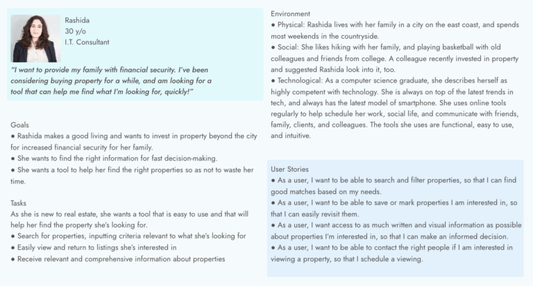
This web app is made primarily for new, small-scale property buyers looking to invest for additional income or financial security.
What?
This will be a user-friendly, responsive web app containing a database of available residential properties and land and comprehensive information on each listing.
When?
Buyers will use this tool when conducting property searches and deciding where to invest.
Where?
Buyers will use this tool at home or on the go. Users can search for properties
anywhere, as long as they’re logged in on a device.
Why?
Unseasoned buyers need access to reliable, uncomplicated information about their potential property investments. Buyers get a feel for a place by viewing
comprehensive information about the property and its neighborhood before spending
time on-site.
Persona
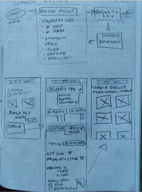
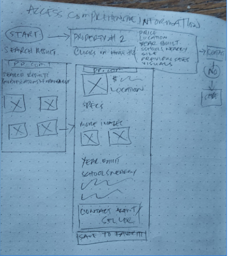
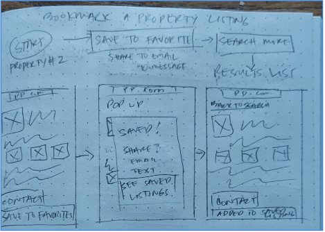
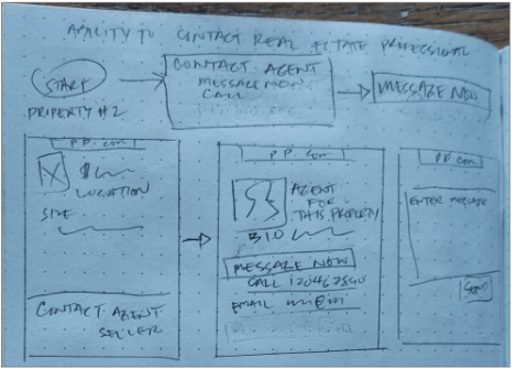
Below are sketches of task flows of four feature requirements for the app. This allowed me to quickly create and design frames that are most efficient for Rashida. I like sketching it on paper before using a design tool as I can draw in all ideas and erase and edit easily.
“As a user, I want to be able to search and filter properties, so that I can find good matches based on my needs.”
“As a user, I want access to as much written and visual information as possible about properties I’m interested in so that I can make an informed decision.”
“As a user, I want to be able to save or mark properties I am interested in so that I can easily revisit them.”
“As a user, I want to be able to contact the right people if I am interested in viewing a property so that I schedule a viewing.”
Rapid Prototyping
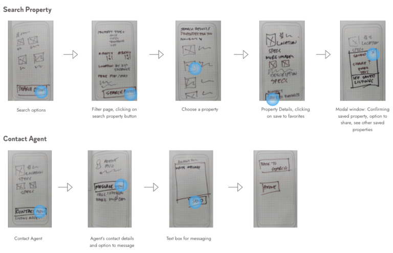
I picked two of the main features that I think are the most important and find out if my design on its task flow makes sense. I conducted rapid prototyping using Marvel and tested it with a couple of people. No negative feedback nor questions was received. They thought it was pretty straightforward.
Moodboard
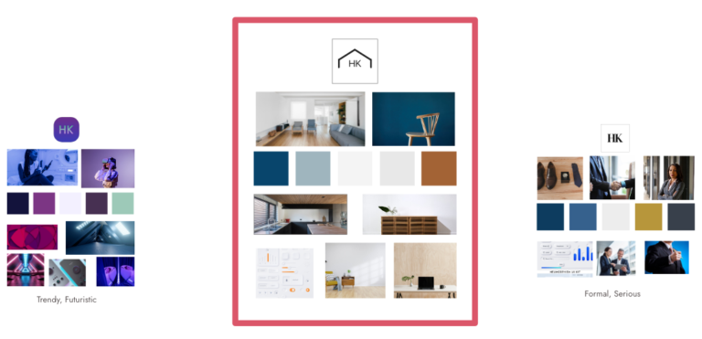
Out of the three mood boards that I made, I chose this one in the middle because my persona, Rashida, seems like a person who likes simplicity. The natural colors of wood and calming blue could be attractive for her as she likes to hang out in the countryside and go hiking with her family. She could also enjoy a modern touch as she has the latest gadgets, and knowing she’s always on the go, the simple and minimalistic design will suit her best. Keeping the design clean and organized will give the app a professional appeal.
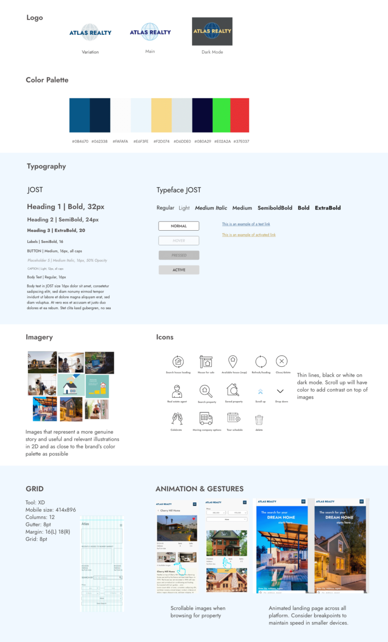
Styleguide
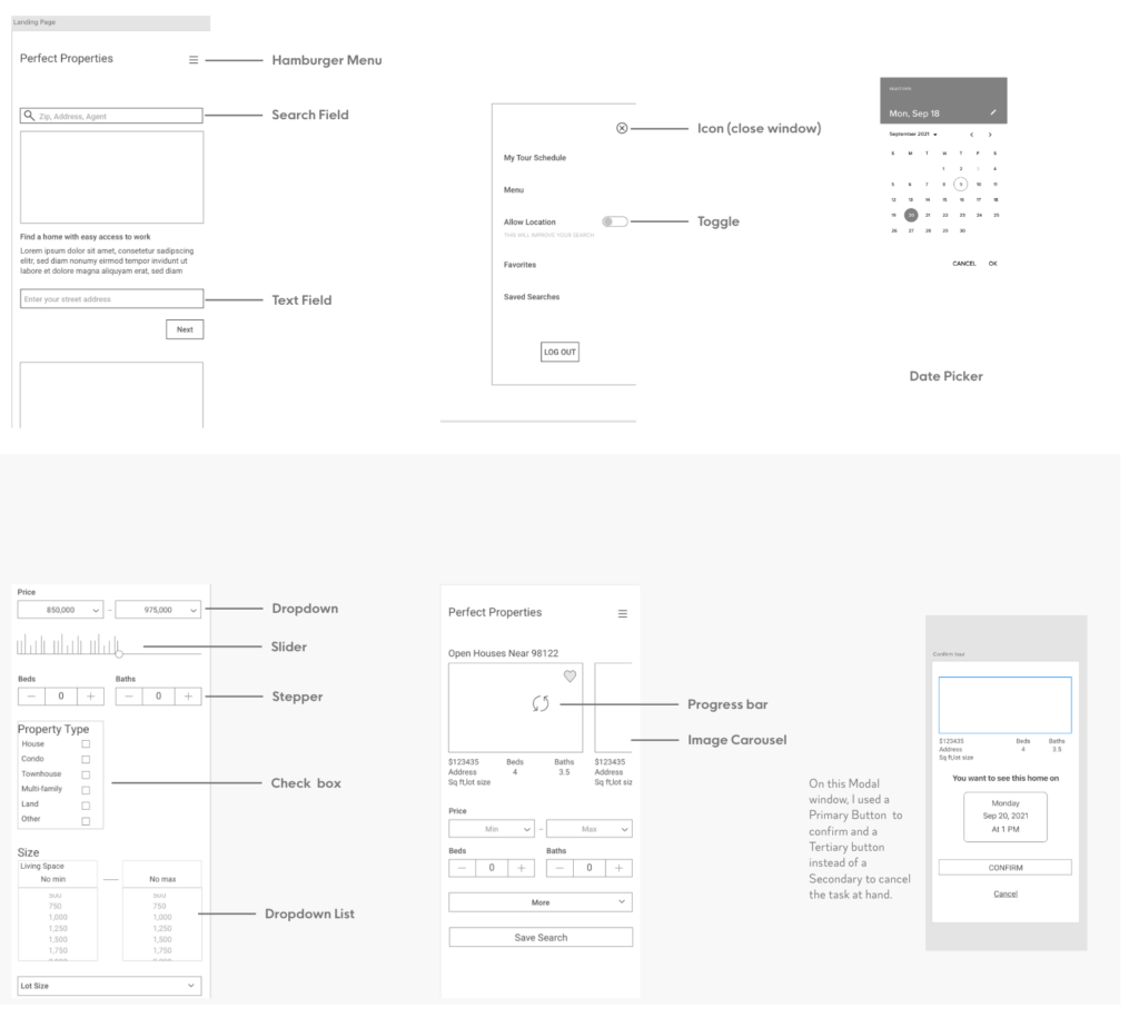
UI Elements
Because this is a responsive website, I followed some Material Design Guidelines and used some of its assets.
Visual Hierarchy & Spacing
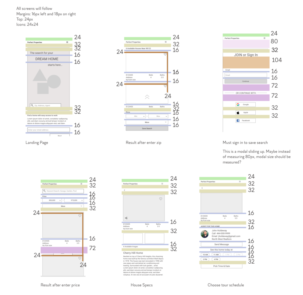
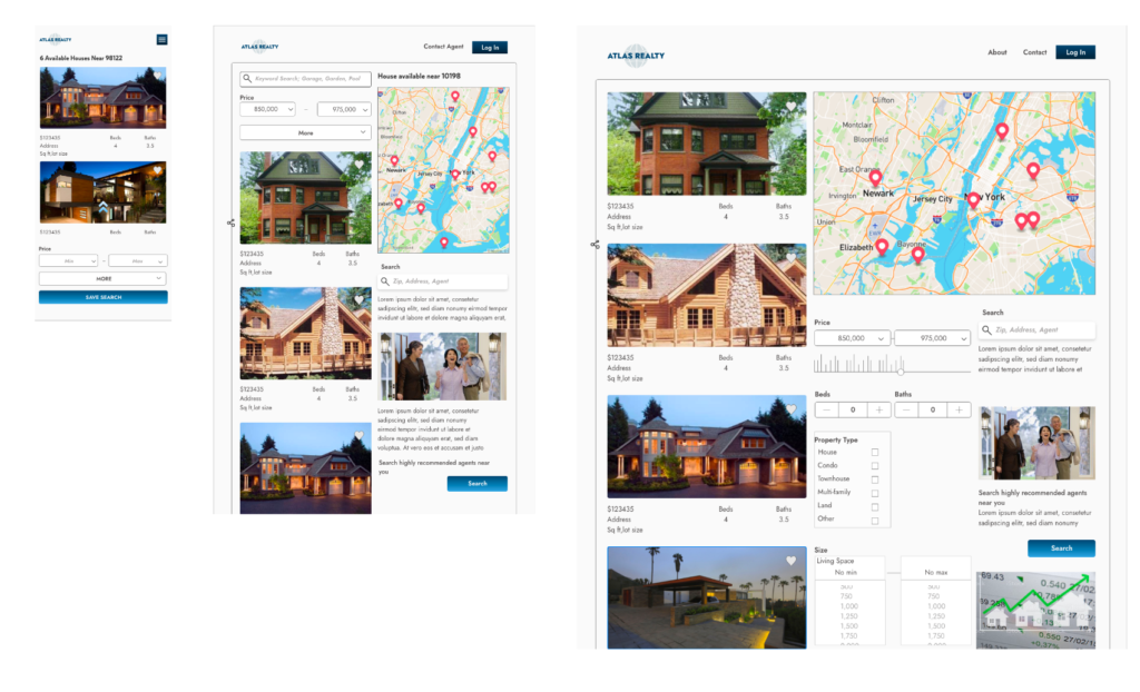
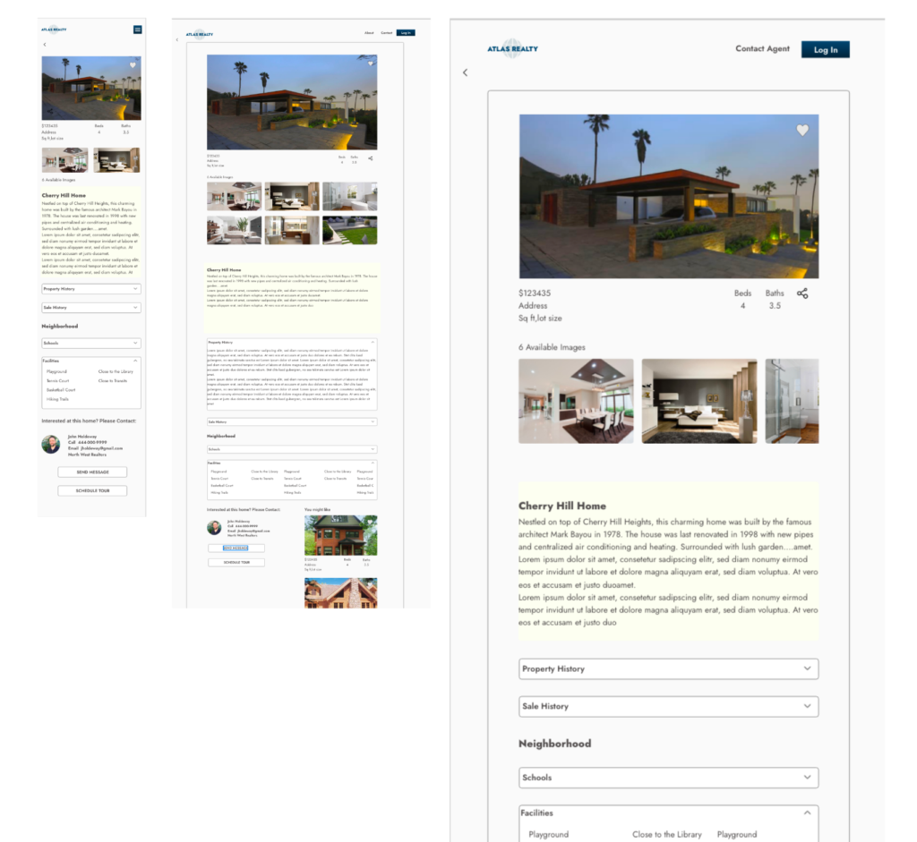
Hi-fi Wireframes
Breakpoints
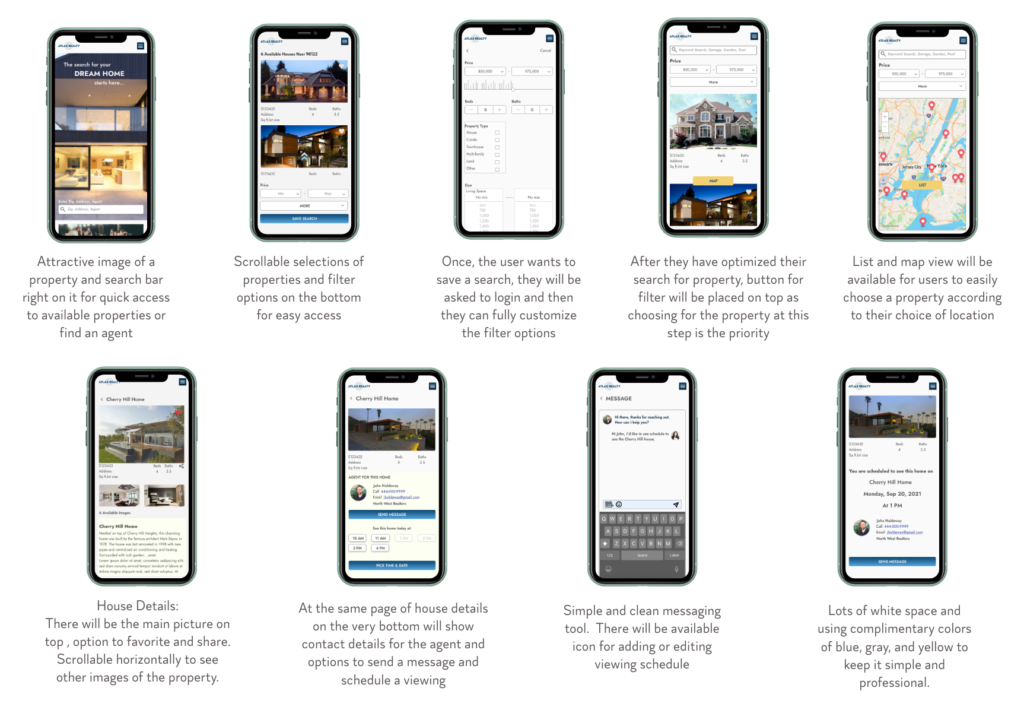
I think it’s important to mention that I approached this project with Mobile-First Design which focus on the important contents that elements, fast loading, and familiar navigation for users.
