User Studies | Concept Ideation | Interaction Design | Data Visualization | Design System | Accessibility
My Contributions
PROBLEM
The stakeholders’ goal for the mobile app is to allow customers to control their breakthrough services to save money. Its main feature lacks usability, and a complete overhaul was required to achieve the business objective.
GOAL
With a successful collaboration with UX and stakeholders, the graph feature now has value and functionality, and customers can oversee their energy usage and save money.
OUTCOME
I was excited to redesign the central core of the app. Improving its usability, user interactions, accessibility, prototypes, and animations with the help of the principal designer in concept ideation and research. And, the developers implemented my designs on time.
PROBLEM
The stakeholders’ goal for the mobile app is to allow customers to control their breakthrough services to save money. Its main feature lacks usability, and a complete overhaul was required to achieve the business objective.
GOAL
With a successful collaboration with the principal designer and stakeholders, the graph feature now has value and functionality, and customers can oversee their energy usage and save money.
OUTCOME
I was excited to redesign the central core of the app. Improving its usability, user interactions, accessibility, prototypes, and animations with the help of the principal designer in concept ideation and research. And, the developers implemented my designs on time.
KPI
To gauge the success of our design, we focused on three important metrics:
Conversion: How many more customers downloaded the app after we implemented the new core feature?
Engagement: How many more users interacted with the feature and gave positive feedback?
Net Promoter Score: We sent out a monthly survey to customers to rate their overall experience with the app.
By tracking these key performance indicators, we were able to determine the effectiveness of our design and make data-driven decisions to improve the user experience.
Summary Process
Since this feature already had a basic structure, although unusable, I focused on enhancing the functionality and usability of its data visualization (graph). We iterated on ideation, user research, and testing before implementation.
Empathize
I analyzed study reports and conducted a competitor research
Define
We found two major issues to be solved for the graph to work for customers
IDeate
I found a few possible solutions and distilled them to mid-hi wireframes
Prototype
I presented my animated prototypes to stakeholders and gathered color combinations and follow ADA compliance
Testing
Internal testing with real data points
Kinda Easy Goal #1
Redesign the energy graph to be functional and easy to read for the average homeowner
Hair-raising Goal #2
Design a graph that will show all service data including energy, EV charging, solar panel energy, thermostat, battery usage, and Net Metering
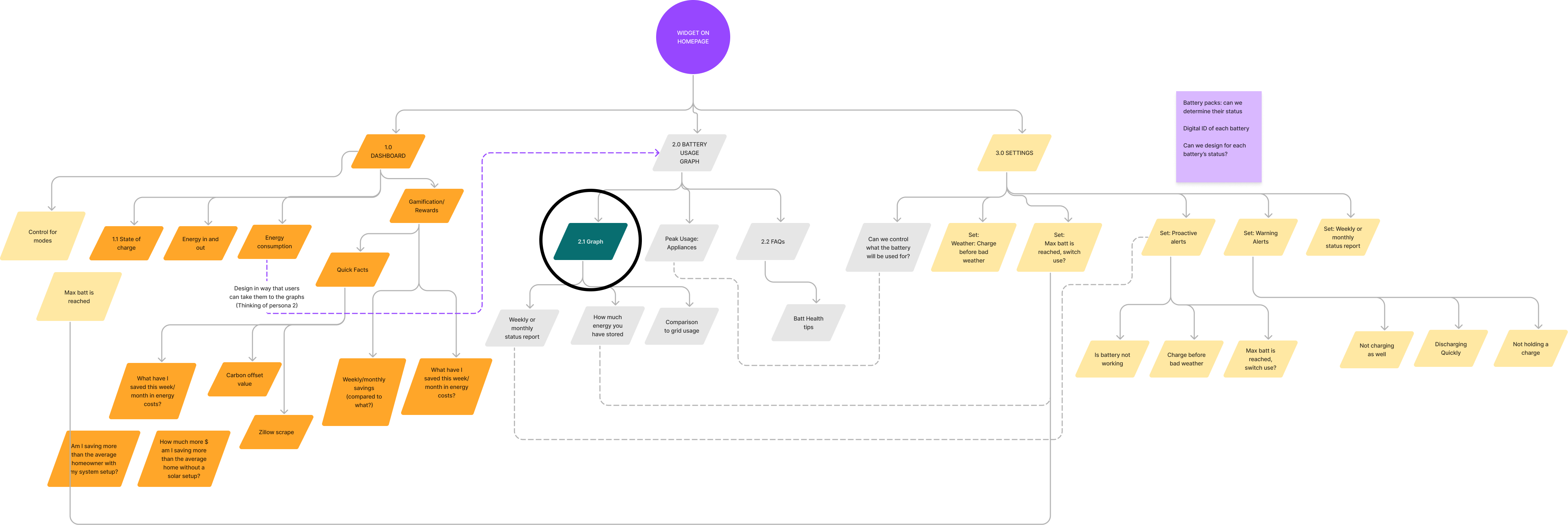
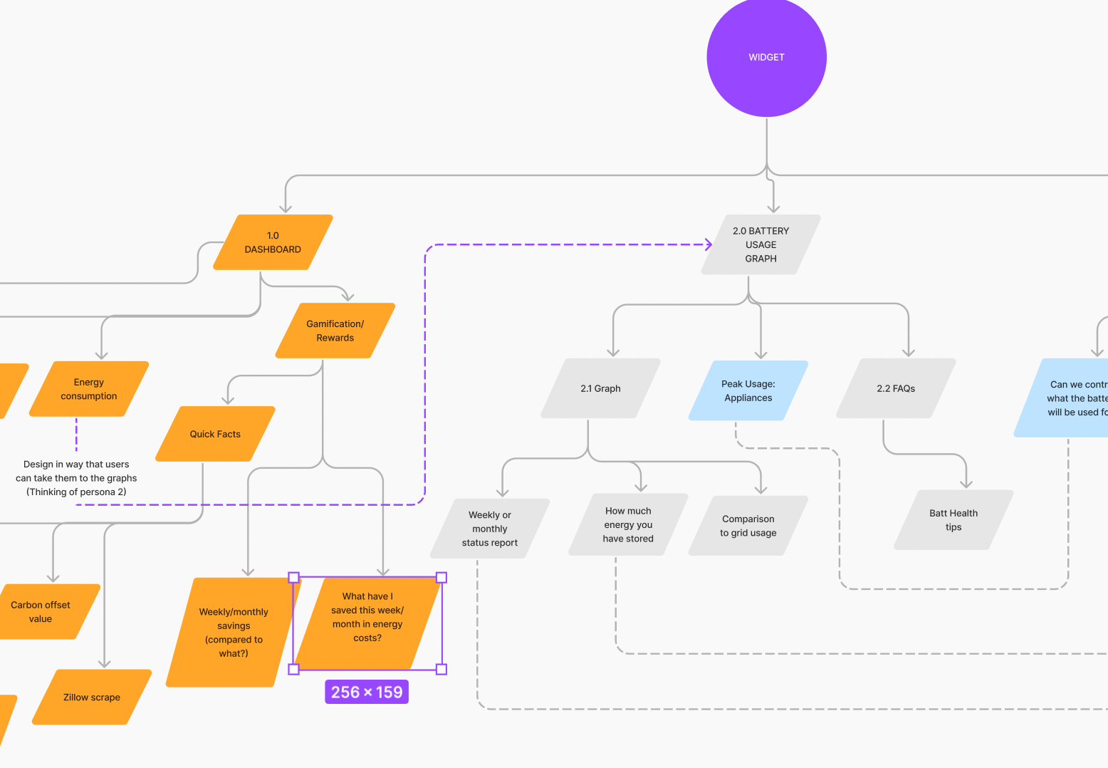
Sitemap that I made during ideation for a different feature. The encircled note is where the energy insight part sits. There are at least four widgets in the mobile app, and all have an energy insights (graph) page.
Gexa customers have one thing in common:
To save money
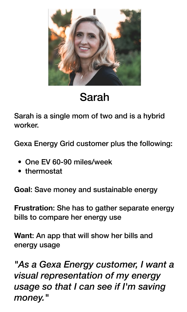
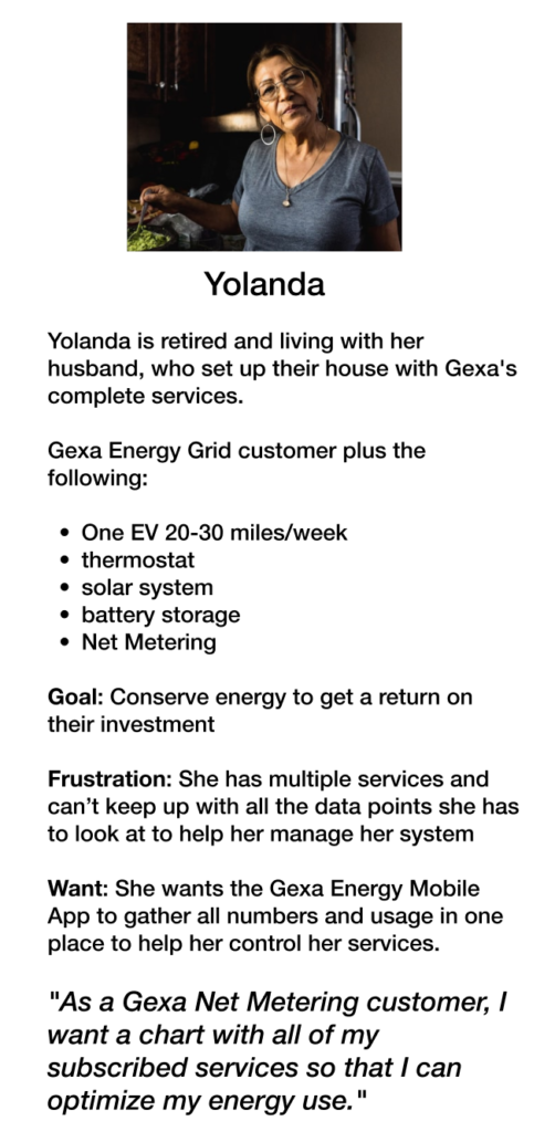
According to our research study, most users are housewives, not analysts, and they need a graph that is uncomplicated and easy to read.
User Story #1
UNDERSTANDING HOW GEXA SERVICES WORK
Notes on business requirement
Physical Product Analysis
DEFINING THE PROBLEM
I analyzed data and watched the recordings of the study conducted by our excellent principal designer, Sandra Moore, on UserTesting.com. We recognized the two new significant issues that must be prioritized to ship the product on time.
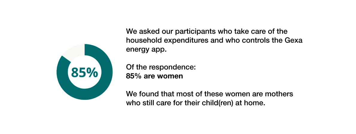
85% of customers want an easy to read graph
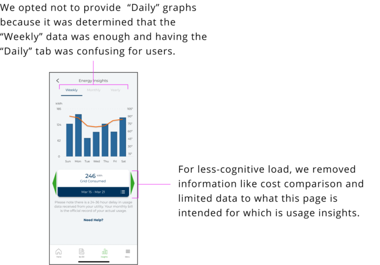
1. DATA VISUALIZATION
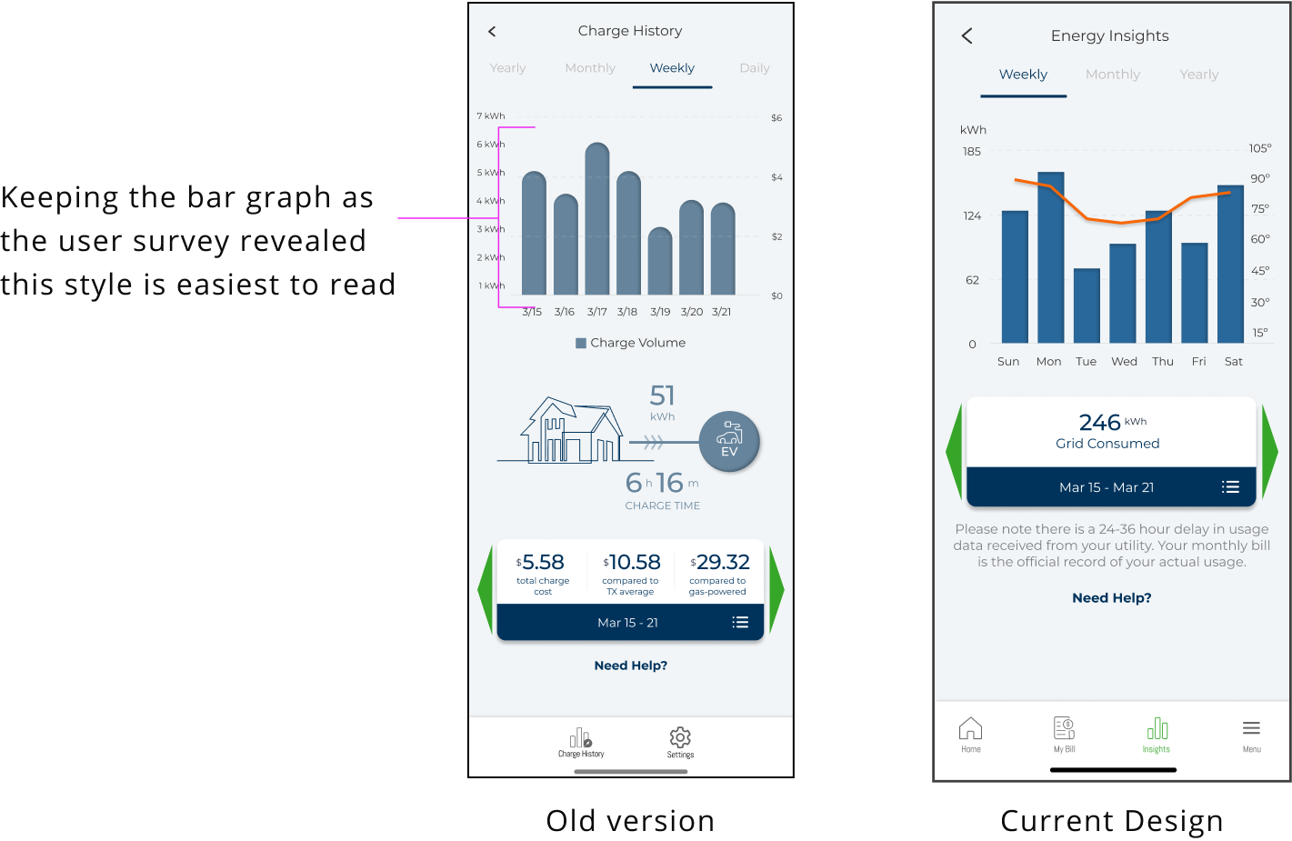
I found that 85% of participants, mostly housewives, do not have the time to analyze lines and numbers. They preferred bar graphs because they were able to understand their energy usage with a quick look so we kept the initial design the previous designers created and enhanced the interface.
2. CONTENT
Most participants needed clarification about the content. We updated headings and terms. I adjusted our wireframes’ alignment, grid layout, and spacing and communicated with the team to finalize the sizes and add them to the design system.
Side note: I noticed all the wireframes in our library need consistent grids, layouts, and headers, so I asked how the engineers code the frames for a quicker delivery. If there is a design system that we can follow to have consistency throughout the project, it will be a smoother process in the absence of a meeting and found that the IOS and Material Design is already in the code and they still need a grid system that we all should follow.
Analyzing conflict on time and cost data
First Goal Done!
After a thumbs up from the executives, I took some time to clean up and make sure everything was aligned, frames were annotated, and exchanged some confirmation notes with our leading developer. I updated components in the library and design system with charts, widgets, and iconography.
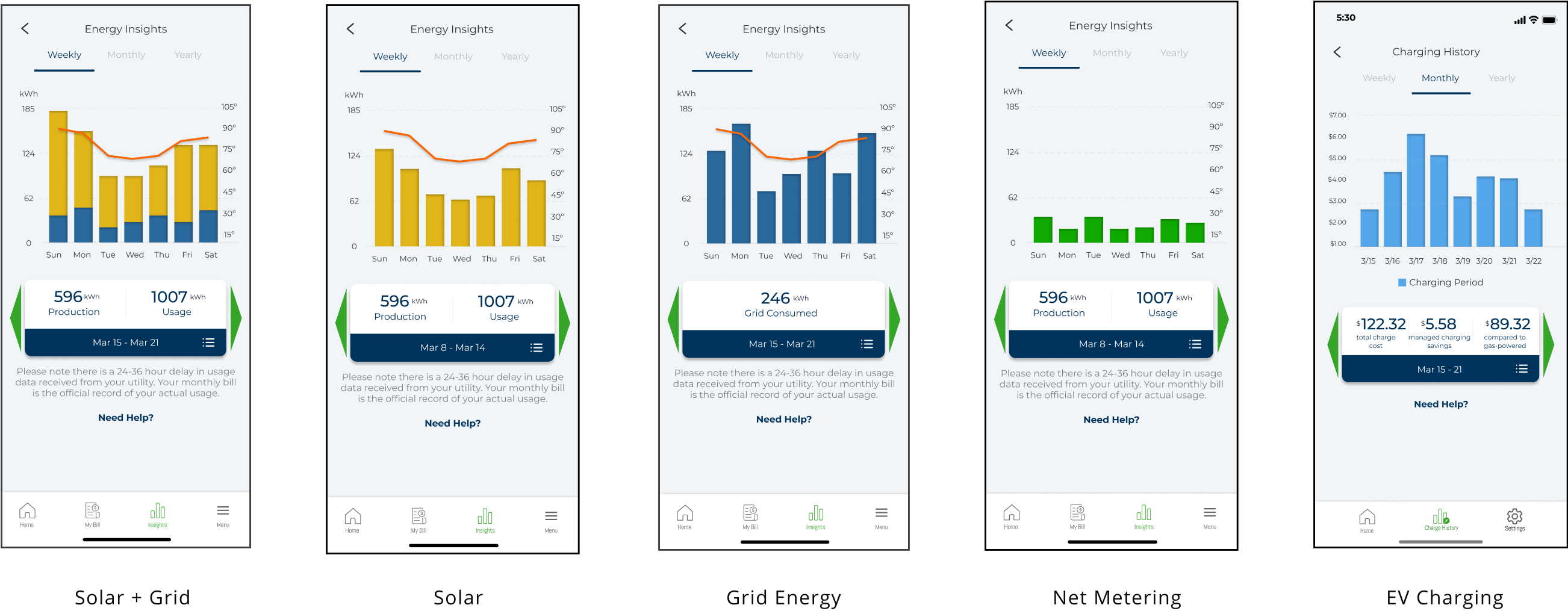
The biggest challenge was when a customer has multiple services — combining five-six data points into one interactive and readable bar graph. It was an exciting design challenge.
User Story #2
New Design Challenge
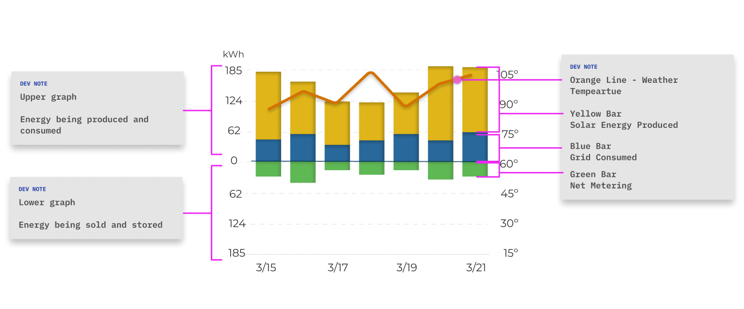
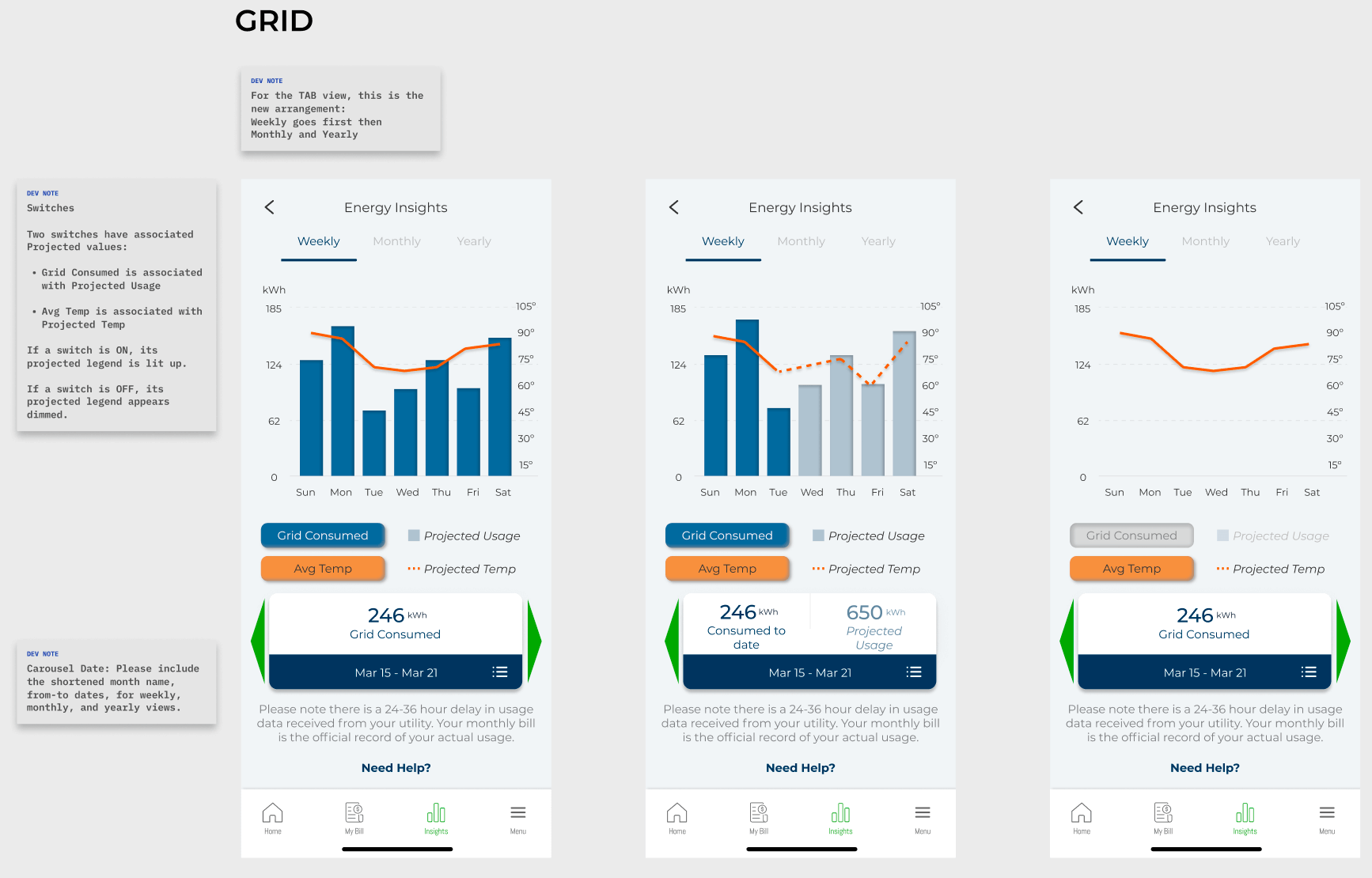
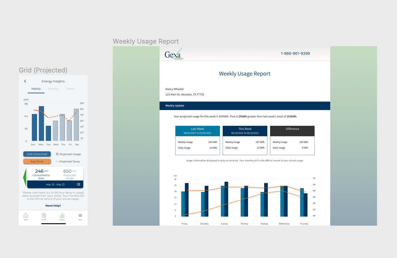
Customers who have net metering or, in some new cases, may have battery storage and EV charging on top of their grid and solar data. The graph with a combination of Solar and Grid works, as you will notice below. It’s still easy to read. But, when we add Net Metering, for example, it is a different story.
What is Net Metering? It allows the customer to sell the excess energy from their solar panels’ use either back to the energy company as credits or for later use. So you see, it is not consumed energy. Outgoing energy won’t work with the current graph style, which only shows consumed/incoming energy.
How do we combine multiple data into one cohesive graph?
Making the graph intuitive and easy to read
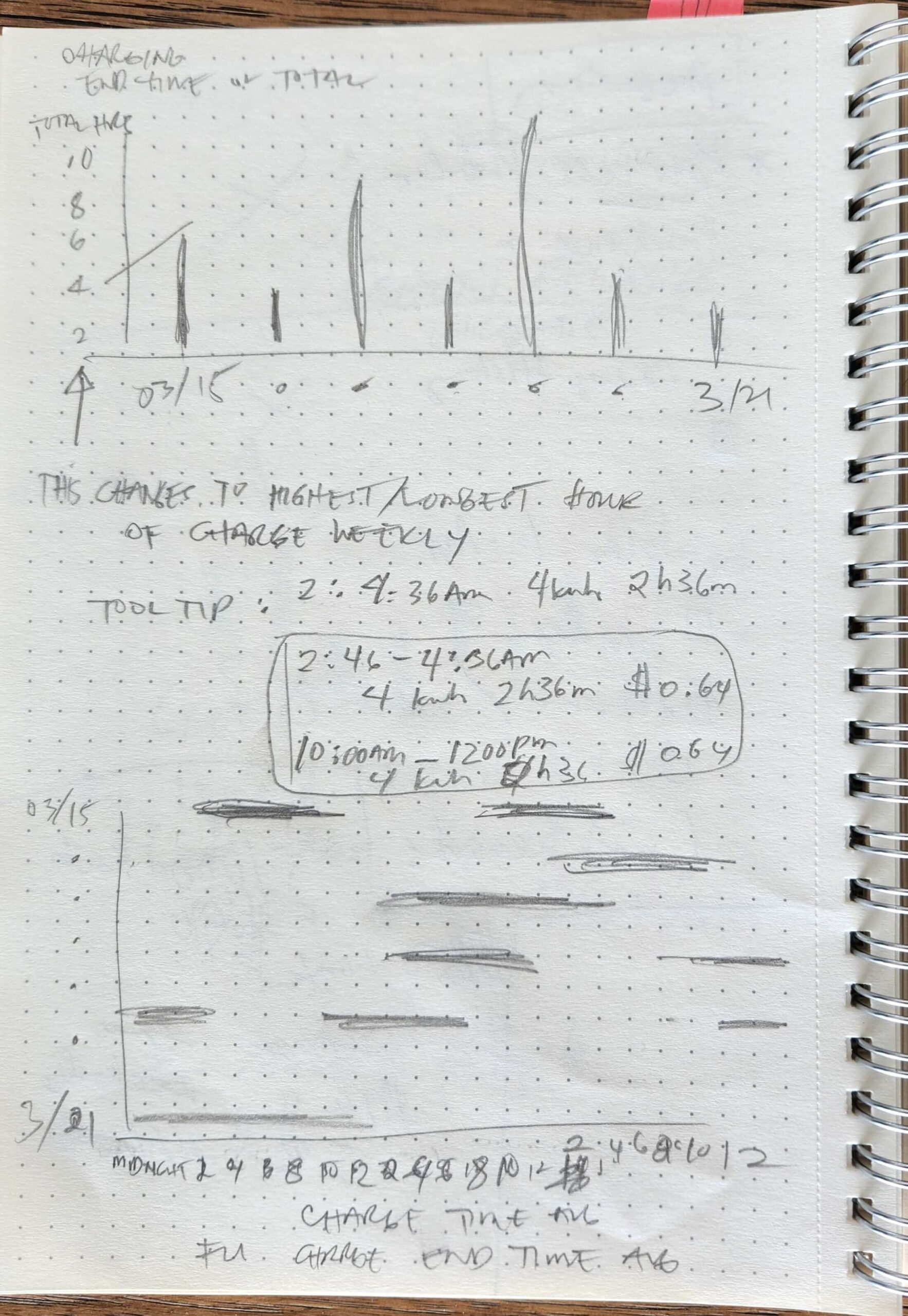
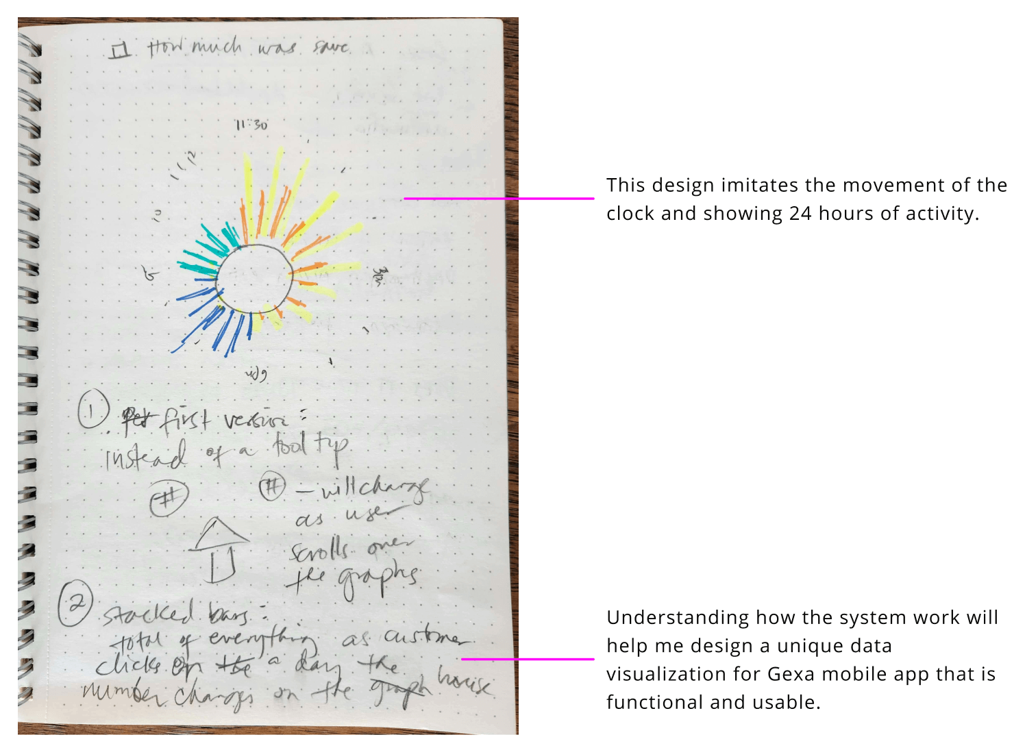
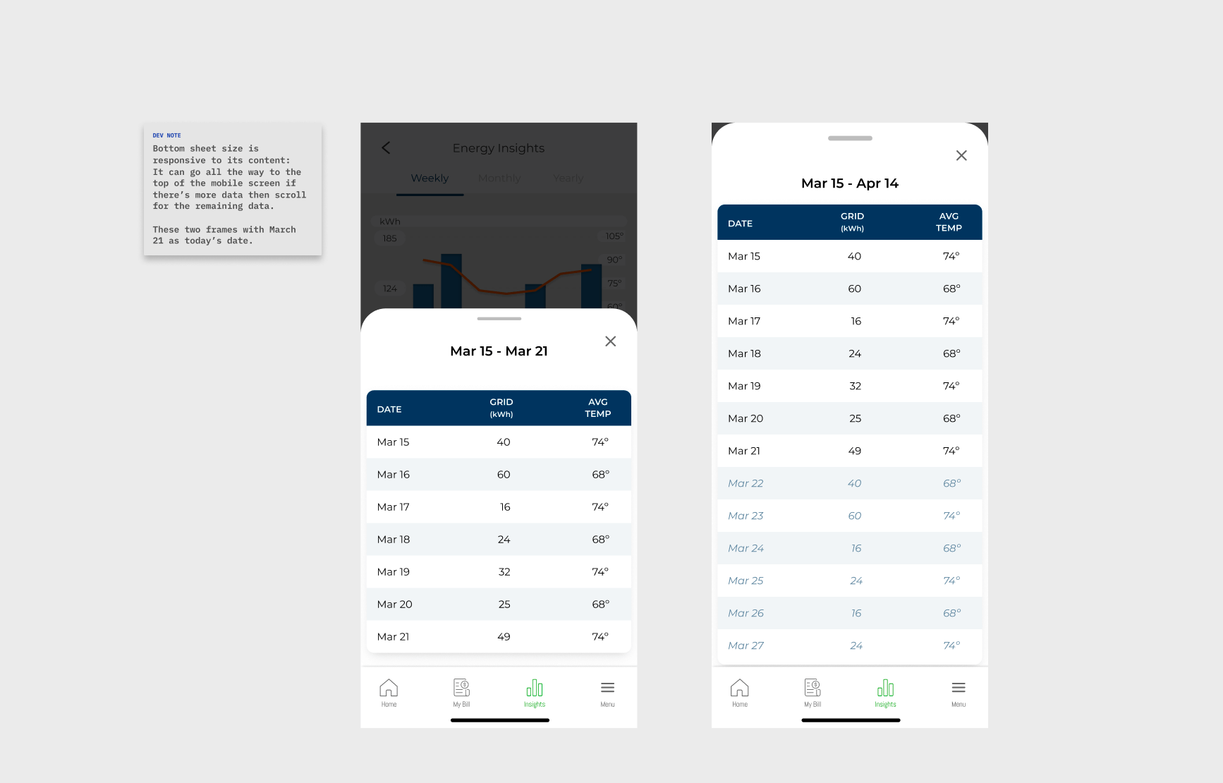
Adding a tooltip when a bar is pressed
Understanding complex data for graph input
Next challenge
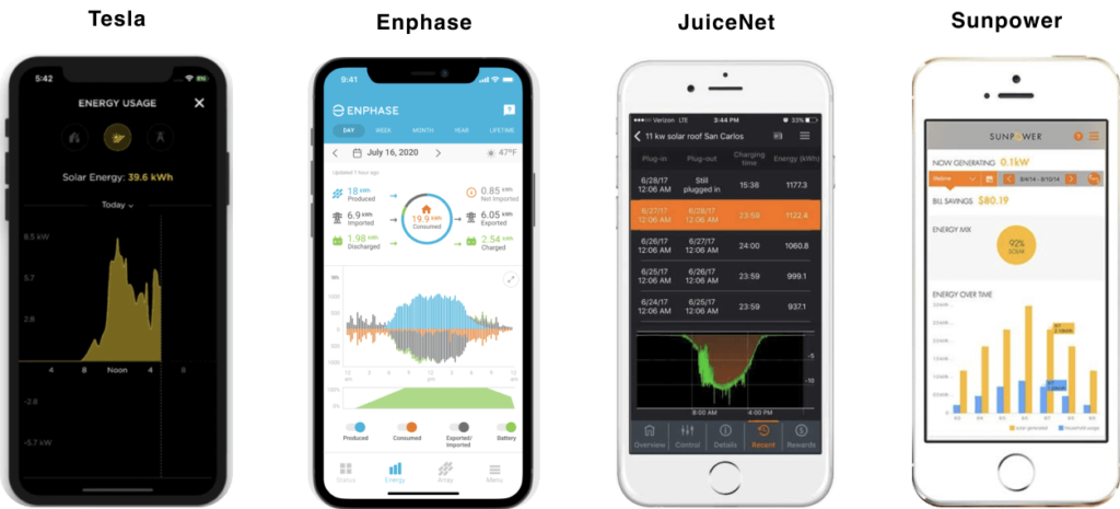
Next steps was looking at four (4) competitors’ graphs on providing energy usage and innovating on ours.
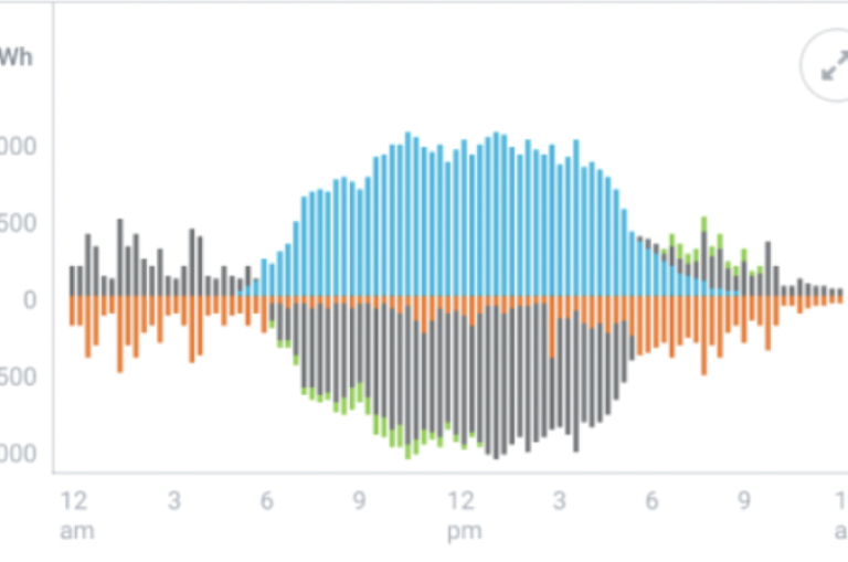
A competitor’s app uses a different type of graph that our users would not appreciate because of its complicated lines, which would take time to analyze. What we got from it, though, was the use of the Y-axis, and we enhanced it to create our “butterfly” graph.
We analyzed a competitor's graph who had the most similar data points we have
This “butterfly” graph has two parts, the upper (incoming energy) and the lower (outgoing energy).
"Butterfly" Graph
(New) New Design Problem
But I found a conflict with having only two parts of the graph: there are also stored, used, produced, and sold energy. Services like Grid Energy and Solar Monitoring can be on both parts of the chart and this would add confusion given that we have to keep the color coding consistent; users wouldn’t be able to distinguish which color is which.
Wrapping my head around all products involved ensuring everything worked together smoothly
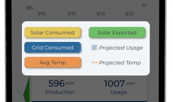
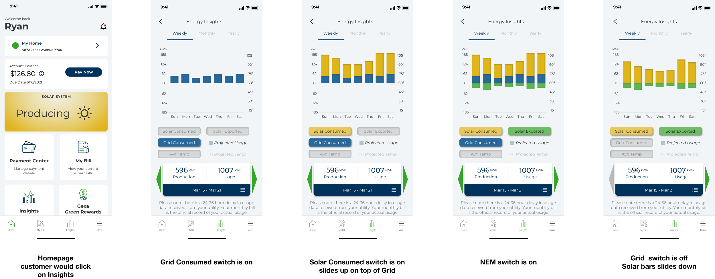
By adding switches, users could choose which chart they want to see and distinguish between used, stored, produced, and sold energy.
Epiphany!
As I was testing the graphs with different data and thinking about a specific user journey, it occurred to me that switches would allow users to see only the information they want. It will also help them understand each system’s effect, one at a time, and their overall energy outlook. At this point, we knew it was ready for testing, and eventually, we shipped the product by the deadline.
Designed these switches for users to conveniently see only the charts to avoid confusion
FINAL ITERATION DESIGN
UI & ACCESSIBILITY
Cleaning up included checking usability for those who are colorblind. I was glad to find an online tool called Colblindor which enabled me to see the chart with different types of colorblindness. Using Adobe color wheel, I meticulously gathered colors that met accessibility guidelines, our brand and the current UI library. Prior to finding this tool I considered adding textures. Not needing to resulted in reduced visual information thus less cognitive load for users.
I designed the hub for the mobile app’s homepage that shows real-time data for customers. I created the animated lines and dots using Illustrator and After Effects and handed off a .svg and .json files of them to the leading developer for implementation.
The feature Energy Insights is now available for Gexa customers.
The hub is placed on the homepage so customers can quickly see the current status of their services.
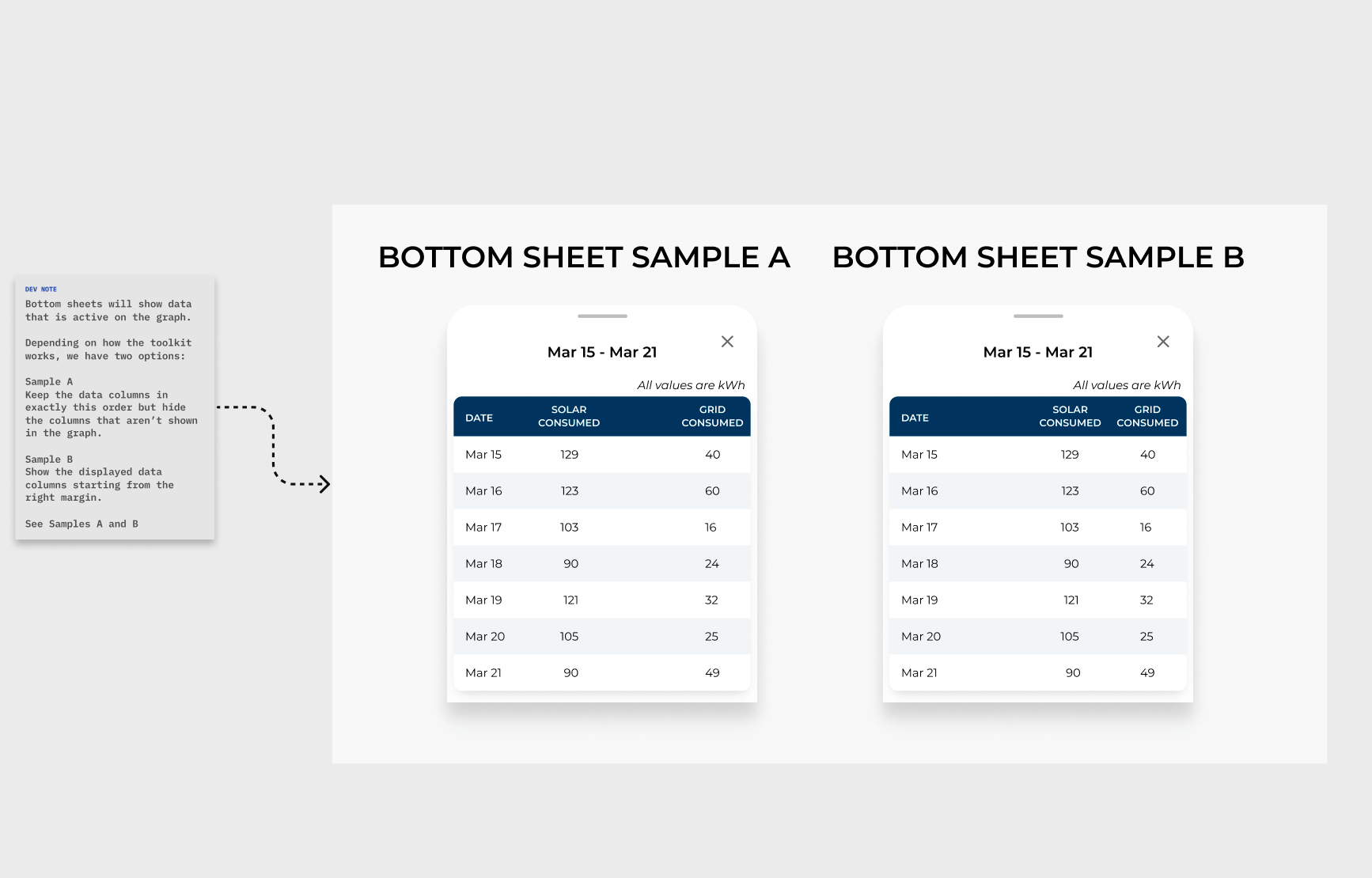
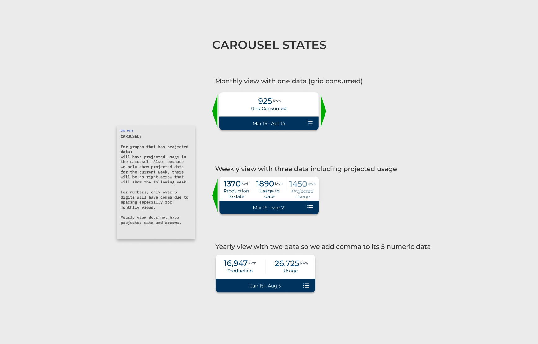
WIREFRAMES with Specs
My wireframes include specifications; annotations, different states, and details on interactions.
After a thumbs up from the executives, I took some time to clean up and make sure everything was aligned, frames were annotated, and exchanged some confirmation notes with our leading developer. I updated components in the library and design system with charts, widgets, and iconography.
Conclusion
Our redesigned mobile app engagement rate increased by 15% in the first rollout. We also received positive feedback about how convenient the graph is, showing that the new design is easier to understand and usable.
I led this project, and I improved my presentation skills and learned that daily stand-up meetings were vital to the project’s success.
This project validated the value of usability and simplicity in interaction design and deeper knowledge of scope and products. I look forward to applying the same approach to any projects to come.
Prototype of interaction with the graph switches
Summary of my work at Gexa
Energy Insights Feature
When I worked with the design team at Gexa Energy, I contributed to the end-to-end process from conceptualization through analysis, design and iteration, and user testing. I collaborated closely with developers, product managers, internal stakeholders, and end users. On a given day, I was doing any of the following:
Aligning stakeholders and informing prioritization through workflow or journey mapping
Prototypes and high fidelity mockups
User testing
Data-driven design
Advocating for user-driven and user validated features at a product team and company level
Working in a small design team in a vast company allowed me to work on different projects in the short period I was there, I:
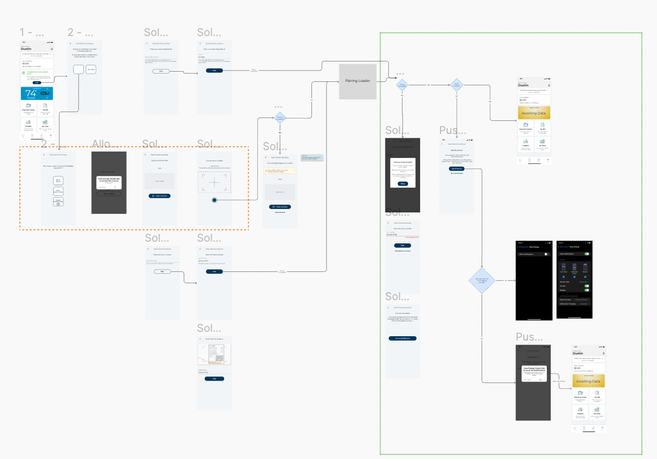
Created user flows and wireframes for designing the interaction for switching, transferring, and moving services, adding functionality, and setting the component up to support future functionality.
Improved the experience by designing a workflow from a banner on the app’s homepage for customers who wanted to purchase new energy plans and services.
Designed the new widgets, matched them to the brand to maintain consistency, and checked ADA compliance for the mobile app.
Designed the workflow and wireframes for adding the camera capture
Conducted user studies and designed UI elements for rewards program to increase user engagement
Updated the iconography for the rewards system and Gexa services.
Collaborated with the product manager and developers in balancing the requirements, conducted user research, and led a user journey session and I initiated a project on a product feature for customers to see their battery storage.
Gathered sales and marketing materials for the initiation of service design to apply visual design and branding consistency
Made a sample B2B video in Adobe Premiere Pro featuring all of Gexa’s services at the request of the executives. Eventually, several prototypes of how the mobile app works were needed instead, and it was my last project.


