Intro
TIMELINE
October 2021-PRESENT
PLATFORM
Responsive Website
INDUSTRY
Scientific Research
MY ROLE
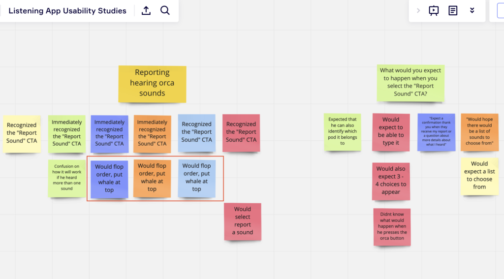
User Studies
Concept Ideation
Interaction Design
Data Visualization
Design System
Accessibility
TOOLS
Figma
Trello
TEAM SIZE
5+
Design Team
Problem
Conservationists interested in the southern resident orcas in the Salish Sea suffer from a lack of in-depth knowledge about orca vocalizations, which makes it hard to galvanize the public to help in conservation efforts to protect the species.
There is no single online learning platform that allows people on the internet to help them identify the sounds of southern resident orcas in the Salish Sea, compared to other marine life in the area.
Goal
Engage users to identify orcas that live in the Salish Sea based on their vocalizations, and encourage these users to assist in conservation efforts to protect these orcas.
Outcome
New user interface for learning section of the Orcasound website.
A peek at what I do:
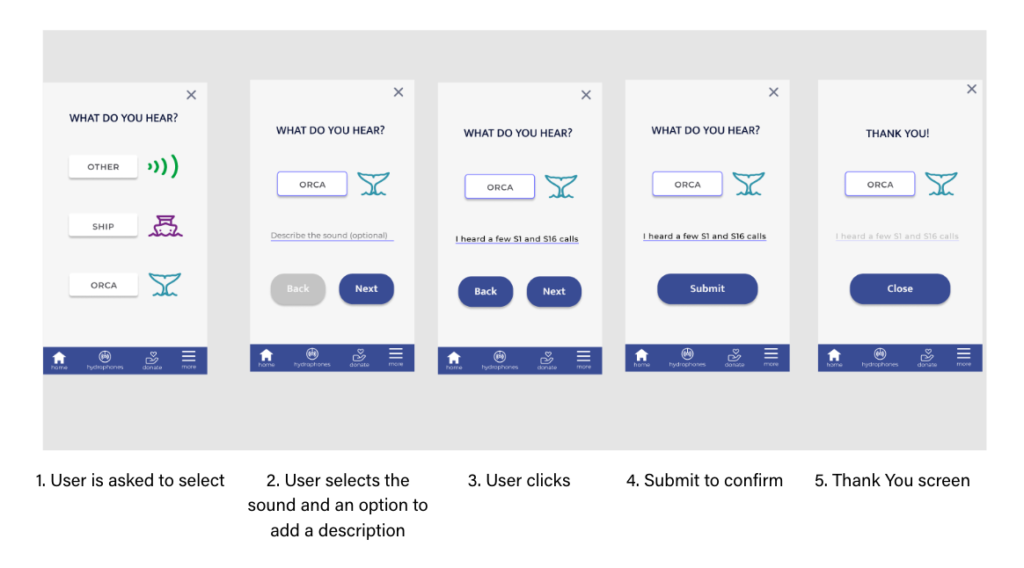
• There were too many screens unnecessary to finish a task. So I reduced the screens for users from 5 down to 3. It was originally down to 4 and after a meeting with the design team, it was decided to remove the “Confirm” page.
• Option for users to click multiple buttons and not just one
• Consistency of buttons
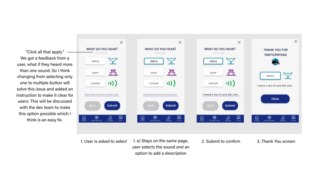
My Revision
The Learning Interface
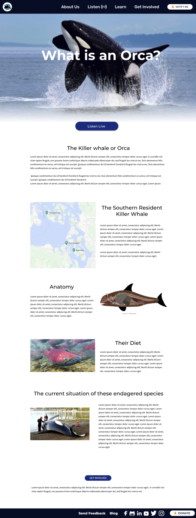
The team is currently working on the landing page of the website. I was designated to create a page to show information about Orcas.
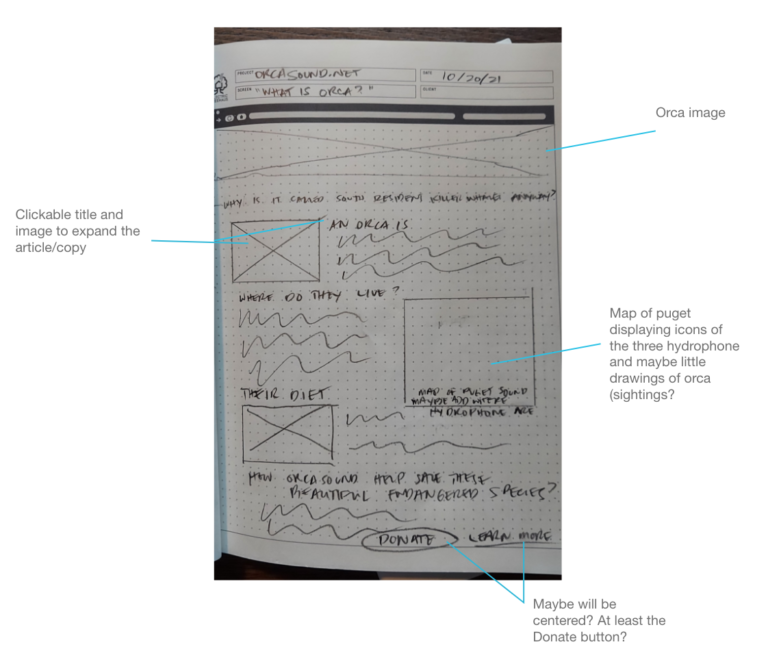
The project owner saw what contents we had decided to add to the page, and he made a critical comment. My mistake was I did not double-check this on the project scope and instead just followed what my teammate started to do.
So, I had a conversation with the copywriter about changing the title and content from “What is Orca?” to “The South Resident Killer Whales,” as the project owner’s primary focus aligned with the scope. The copywriter will work on the topics and arrangement. She also agreed on the layout I designed, and we will keep that.
Call Catalog Page
I am also designing the Call Catalog page.
Background Color
When we finalize the buttons and graphs we want to add to the page, we decide if a background color would appeal to users with some help from usability testing. The past designer chose to add a background color, and the project owner thought it was for dark mode. I decided to make it white because of accessibility and consistency, and I mentioned that dark mode should be available on all pages and can be set on the back-end.
Filter Options
The project owner liked this addition by the past designer, and he recently suggested adding a button for the types of tones. It is a great idea, but I’m unfamiliar with how scientists record and keep these data. I had to ask if all sounds have tags or categories linked to them to analyze better how to design the filters effectively.
Graphs
The project owner asked if the visualization plays when the play icon/button is selected or if it’s static like a “waveform” (amplitude vs. time graph). I wanted to reach out to the developers about technical limitations before finalizing the design.
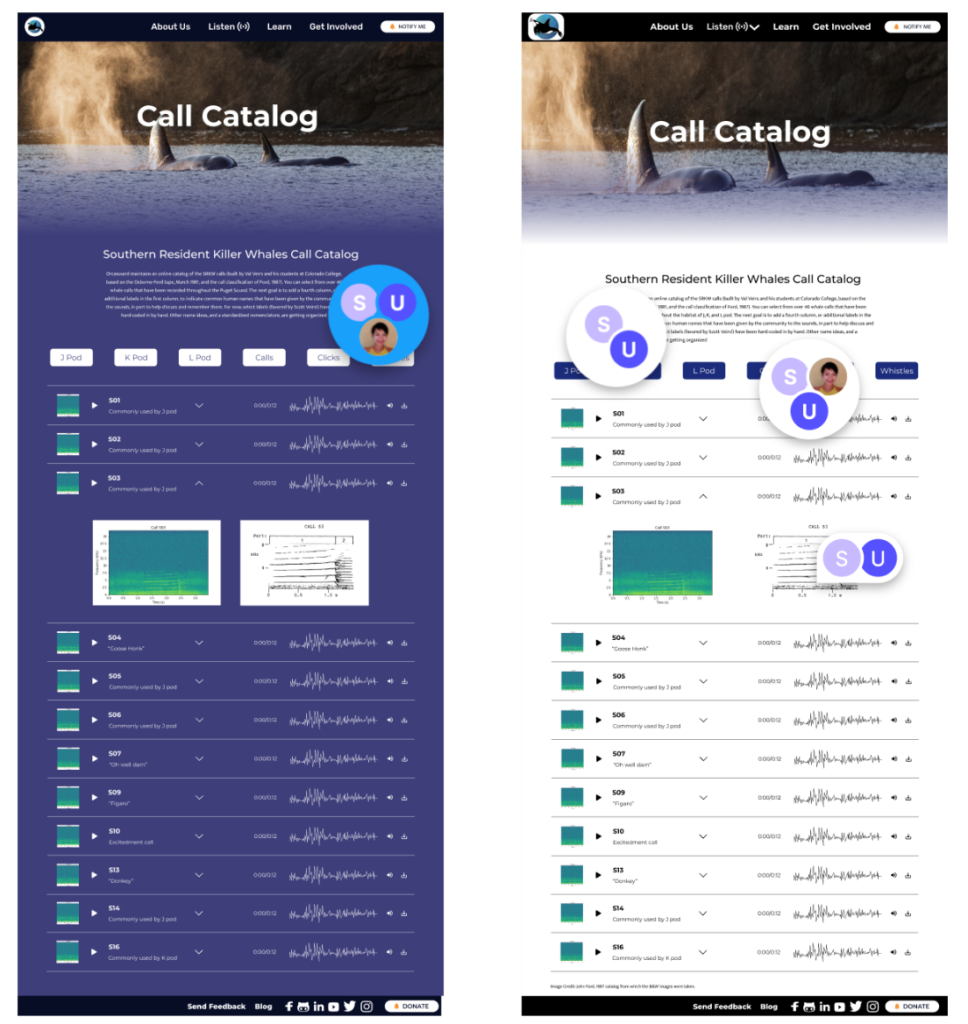
Left: Old Version Right: Current Version
